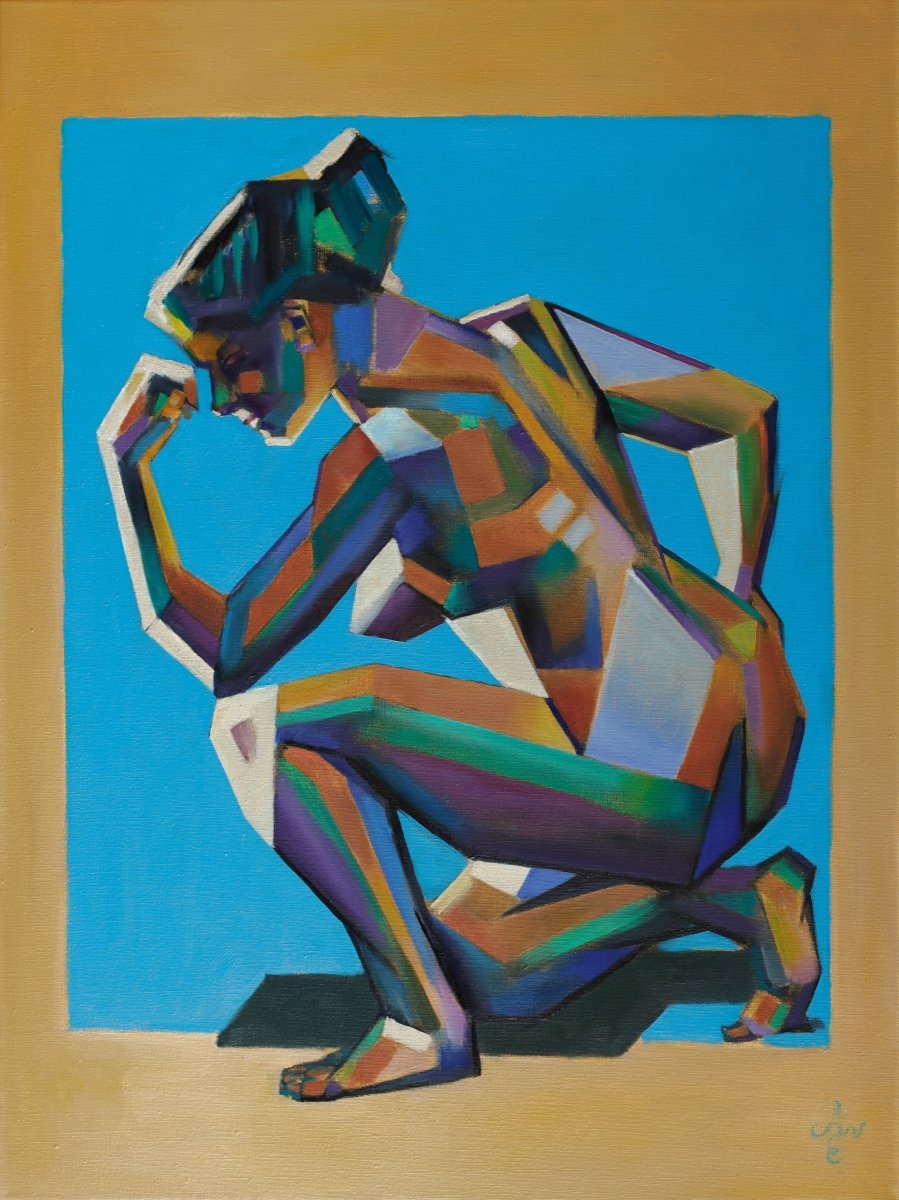
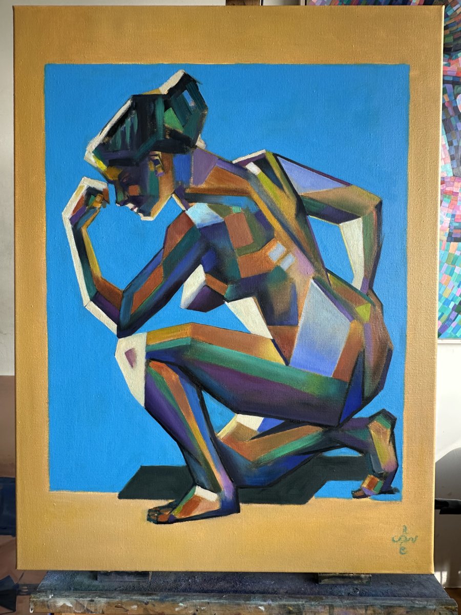
This oil painting ‘Neo Deco | Chromatic Syncopation – 2026-09-27’ is an experiment with a beige background. With a spot color blue obviously. Last month I made a prestudy, called ‘Rhapsody in Blue’. In the art statement to that pastel drawing I talked about putting myself on a color diet. Of all the pastels I made so far on this AMI beige sketching paper, this one could be my favorite. Time to put it into oil and see what that might bring me. A 4:3 ratio-linen is bulkier than A4-size paper. No troubles so far. They came to arrive much sooner than I thought though!
The Build-up Was Easy but Then …
By sooner I mean that the oil itself - priming and measuring out proportions - came very quickly. The quicker the better you would say, but it will only lead you into murky waters without delay. What to do next? The answer will perhaps not surprize you: dive straight back into the realm of colours. Upon my word, I didn’t plan to, and I solemnly took a pledge not to use many of them. However, these are my findings and let me share them with you. For a freak reason black and white and two other colors seem to work in a small-format work. Not on a bigger surface such as 60 x 80 cm linen though, at least not for me. I mean, those hugh white, grayish and black planes simply looked preposterous to me. A strange conclusion indeed, because I am known for my monochrome drawings.
Finding Proper Color Relations
So, I set out to find proper colour relations that would work, again. But hey, try and error, frustration: not again. Lo and behold: no troubles here. I already was aware of the fact yellow should be present in the body. Next, I chose a brownish orange to counterbalance blue. Purple came a bit later but was necessary to tune down all things yellowish. Green did its job quite nicely too. Last but not least, I tuned down saturation levels in daylight and that was it.
Coming up … with a Title!
Sometimes it happens, an oil within a reasonable time. Thanks to the prestudy of course. Sound preparation always makes a difference. But hey, now that I am writing this art statement, I came to realize what I painted and why. Surely, a deviation from that prestudy, so I could not call it ‘Rhapsody in Blue’ anymore. Why would I, the title is unique. With this found palette of colours I had to come up with something else anyway.
Unpredictable and Loose
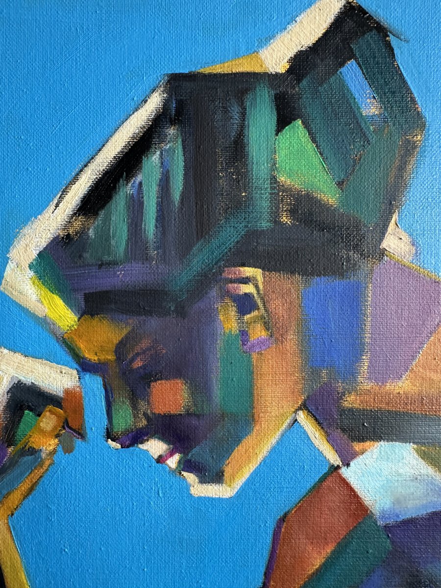
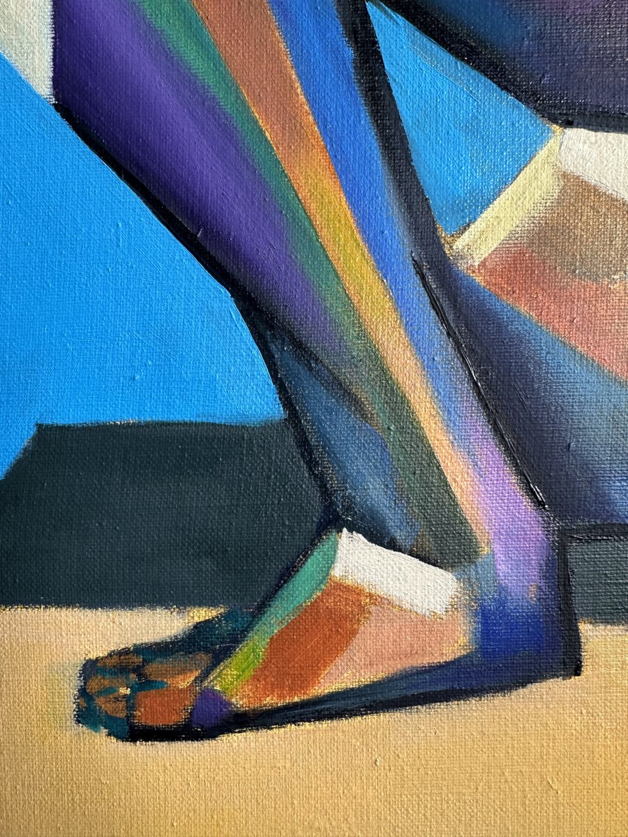
Then I thought of something completely else and that was what I was planning for all the way: a break in predictability. You see, my Neo Deco and cubist forms often rely on strict, geometric harmony. In recent years, I wanted to paint in a looser way, except for my In Hoc Signo painting of course. A sound reason to turn a different corner: more unexpected angles, sharp contour lines, combined with rough and organic texture. They create that typical visual syncopation: an abrasive, lively dynamic that keeps the eye alert. In short: Chromatic syncopation captures exactly that it is not a static portrait or decorative pattern. Very important in these AI days. Instead, I wanted to invent a bit of a visual chord. One in which accents have been deliberately shifted to create tension.
Cyanide
The powerful cyan accent color breaks those loose patterns most deliberately. The accent lies just where you least expect it. Could this be the visual polyrhythm I was dreaming of all the way? Just as jazz musicians play with beat and counter-beat, the planes of the female figure play against the background. The composition does not follow rigid academic rules but swings through the rhythmic alternation of light and dark planes (chiaroscuro). Wow, I got what I wanted in the end: the tension between sleek and raw: The term ties in directly with the origins of the pastel drawing ‘Rhapsody in Blue’ nonetheless. Indeed, the elaboration in oil does justice to the initial concept.
Technical Details
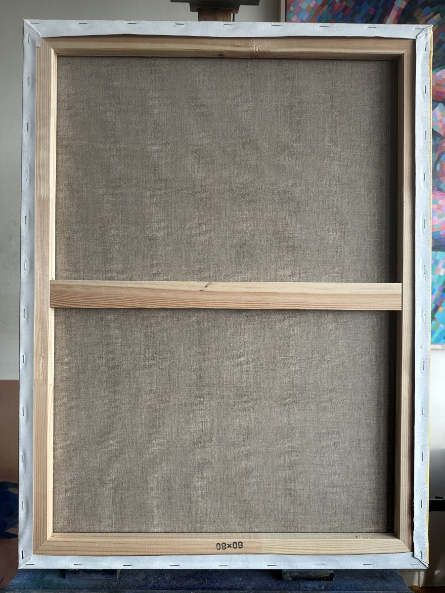
Oil on linen (60 x 80 cm)
Artist: Corné Akkers
More details
Location
Atelier
Subject
Nudes and erotic
Style
Cubism
Orientation
Portrait
Size
80 x 60 x 2 cm, 1 kg
Created
2026/01/15
Artwork is painted over the edge
yes
Substrate and Material
Substrate »
Canvas
Material »
Oilcolor
Video
Frequently asked questions about this work
Who created “Neo Deco | Chromatic Syncopation”?
“Neo Deco | Chromatic Syncopation” was created by Corné Akkers.
How much does “Neo Deco | Chromatic Syncopation” cost?
The price is 6,000 euros.
How big is “Neo Deco | Chromatic Syncopation”?
The work measures 80 x 60 cm (height x width).
Is “Neo Deco | Chromatic Syncopation” still available?
Yes, “Neo Deco | Chromatic Syncopation” is available.